I created a dummy start-up airline which I branded “Rayair” and as a graphic designer, I created the Rayair logo and branded blank aircrafts on pictures illustrating the website.
To do it right, I observed how real people search for existing destinations and book a flight on existing airline websites. I discovered many opportunities for improvement and pain points, which highlight common design mistakes to avoid.
Here below is an overview of the full UX Design process I went through.


As my case study industry is air travel, I have choosen 3 airline websites to benchmark against : Ethiopian Airlines, Brussels Airlines and Emirates.

I mostly want to focus on how the process flows when the user is searching for information and how effective is the flight booking form.
When a user is looking for a place for holiday and visits a specific airline website, the first thing he wants to know is where they fly or destinations. He expects to get that important information in one click.
When a user reach the navigation bar of Ethiopian Airlines homepage looking for existing destinations, he is lost and has to hover into the hamburger menu drop box on the top right, get into “Flight network” and click on “International link”.
He then ends up on a page with a small form with 2 fields asking to select “your origin” and “where you are going”. You just end up booking a flight. No direct link for reaching information about the different existing destinations, quite frustrating.
Brussels Airlines website offers the same frustrating experience when looking for destination link. The user is lost and must “try” all the links in the top navigation menu to find “Destinations” link within “Plan & Manage” link.
When the user clicks on “Plan & manage” link, it deploys a drop-down submenu where “Destinations” link is clearly diplayed within “Book a flight” column. No further step, which is a bit better.
Positive interaction:
On Brussels Airlines website, the “Destinations” page displays a dynamic and interactive world map with all destinations displayed with price rates. User can just click on the destination to access the information.
The budget filter allows the user to display flights within a specific price range, very useful feature for the user.
Pain point:
On Ethiopian Airlines website, the user can’t find any link for reaching information about the different existing destinations.
On Brussels Airlines website, when the user selects a flight, only a booking form and prices are displayed, no additional information about the destination itself
Here is the best practice we should emulate:
Let’s have a look at Emirates website. In the navigation bar, you immediately find the link “Where we fly” and when you click on it, it displays the different continents and from there, you reach the countries and the cities of your choice with beautiful pictures and detailed useful information such as good restaurants, places to stay, visa requirement, airport information and car booking. A link for booking the flight directly is clearly displayed as well.


I conducted a comparative usability test with one user, a student in Brussels who is used to travel to Dakar (Senegal) where her family is located. The test is done on the desktop version of two airline websites: Ethiopian Airlines & Emirates.
![]()
For the purposes of the test, the user had to do the following:
* Book a flight from Brussels to Dakar
* Departure on mid-December for holidays
* 2 people (2 adults – the user and her boyfriend)
During the usability testing, I was the moderator and note-taker, creating a comfortable environment for the user and guiding her through the session. I recorded the user and took note of all her input and actions throughout the testing process.
At the end, I examined the recordings closely and analyzed the data. I Paid attention to what the user say, do, and do not do, to gain insights into her behaviour and thought process.
She pointed out that both websites, but especially the Ethiopian Airlines website shows a very nice progress bar on top area of the page, allowing her to know exactly where she is and the number of remaining steps ahead.
She mentioned that the progress bar of Ethiopian Airlines website is illustrated with icons, which makes it more engaging than the one of Emirates, which she found a bit minimalist.
When searching for a flight on Ethiopian Airlines website, she pointed out that the flights listed display as well the number of stop-overs clearly shown in red color and the airport code. She then assumed that the red-colored info is a link which allow to have more information, but it ended up not being a link.
She was disappointed that she ended up only knowing the number of stop-overs, the duration and the airport code ( not the city ), while on Emirates website, stop-overs are links which allow her to get more information about the stop-over place.
On Emirates website, she found the preloader ingenious: she liked the way it entertain her with a small animation of planes moving around when the page is loading, and in addition, it informs her about special offers or advantages offered on board. She felt she received useful information and therefore did not have the feeling of wasting time when the page is loading.
She found that Ethiopian Airlines’ homepage is clean and minimal, simple and easy to use. She found the process was fast and she was not confused on where to go or what to choose, though some lack of information about existing destinations and stop-over locations.
Emirates website, on the other hand, she said it offers a lot of information about class options and felt it gets sometimes to the point it looks overcrowded, quite confusing that she may find difficult to make choices.
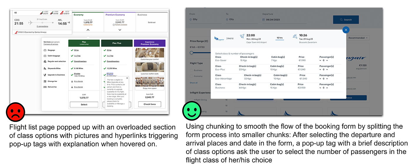
After selecting the departure and arrival places and date, the flight list page popped up with an overloaded section of class options with pictures and hyperlinks triggering pop-up tags with explanation when hovered on.


I conducted an affinity diagram with 2 participants and submitted them all information I got from user research on Ethiopian Airlines, Emirates and SN Brussels Airlines.
Participants were encouraged to share their thoughts, insights, and observations about the websites. Each participant wrote down their thoughts on separate sticky notes and placed them on a white board.
After the initial idea generation, we launched a discussion to identify similarities, connections, or patterns among the sticky notes.
The final affinity diagram presents a visual representation of the collective understanding of the user needs and pain points associated with the flight booking websites.
Pain points and issues:
*** Poor scan ability: A user visiting an airline website expects to reach the existing destinations in one click. The problem mentioned here is that the user must hover on many links to find his way to the existing destinations, after 2 or 3 clicks. This is so frustrating that the user may leave the website and search somewhere else.
*** Visual overload: cluttered website overwhelms users with too much information, making it hard for them to locate the information they’re looking for. Important elements don’t stand out, and users struggle to understand what actions they should take next. This can result in users abandoning the site in frustration.
*** Uncertainty and Frustration: Users often visit a website with a specific budget in mind. If they have to go through the whole list of flights to find the flight that fits in their budget, it may result in wasted time and lead to frustration. This uncertainty will discourage them from exploring further or making a booking. Without a price range, users might suspect hidden costs or feel that the company is being deceptive.

Our customer journey map’s key touchpoints in our case include:
- finding and navigating on the website
- searching for existing destinations
- booking a flight
- selecting a flight in the flight list
- confirming the booking through checkout/payment
As you can see on the customer journey map, the main challenges are encountered within “search for existing destination” and “select your flight in flight list”, where you find the red frustrated icon.
Those challenges are the pain points and issues listed in the previous section, ie main information such as existing destinations not available in one click, cluttered website overwhelming users with too much information and uncertainty due to lack of price range filter.


In our case, user flow diagram shows the steps involved once you access the homepage and proceed for booking a flight:
- On the landing page, the booking form must be reachable in one click, or directly displayed there.
- Inputting travel details in the booking form such as departure place, arrival place, departure date, number and type of passengers and flight class
- Selecting a flight in the flight list, based on best date & price.
- Inputting passenger’s information such as full name, email, nationality…
- Selecting a seat in the seat chart
- Proceed for payment / Checkout
- Booking confirmation
This visualization helps to gain a clear understanding of the entire process and will serve as a guide for the structure of my wireframe

Let me show you how the user flow diagram helped me to hand-draw the screens of each step.
All screens will have the traditional main structure with a header, the main content area and a footer.
On this drawing, all pictures such as the main logo, featured photos, icons and all other pictures are represented by a cross in a rectangle shape. Links or small text are represented by lines, places ( cities ) in the search results tags are represented by multiple crosses and social media icons are represented by small circle shapes.
From the landing page through all the booking process, we will only need those 3 screens as shown on the drawing here attached:
*** Homepage ( or landing page ) on top left side of the sketch:
As stated in the previous section, on the landing page, the booking form must be reachable in one click, or directly displayed there. I decided to display the form on the homepage: On the hand-drawn sketch here attached, you can see on the first screen on top left side, that I draw the booking form inside the header of the homepage.
All the process of filling the form with all details such as departure place, arrival place, departure date… is made on this page.
The main content part in the middle of the page displays photos with captions of existing destinations.
Hitting “search flight” button on the form will lead to the flight list page.
*** Flight list page on middle right side of the sketch:
On this page, each flight in the flight list is displayed on a tag with the company logo on top, departure and arrival places, icons of take-off and landing aircraft, times of take-off and landing and a “choose this flight” button which, when clicked, leads to the booking information page.
*** Booking information page at the bottom left side of the sketch:
This page displays 2 columns. On the right column, all details about the selected flight are displayed and on the left column, a form for collecting passenger’s information is displayed, allowing the user to fill in personal data.
Those sketches will be a great help for building a clickable wireframe prototype using Figma.


After completing my initial design sketches, I translated them to a clickable wireframe prototype which I created using Figma software.
I started by creating basic shapes and layout elements, matching the structure of my sketches.
I enhanced the wireframe by adding interactive elements such as buttons, form fields, menus, and navigation elements.
I used the wireframing tool’s functionality to link different screens together, creating clickable interactions that mimic the user flow of the booking form.
I Include annotations and notes within the wireframe to provide additional context or instructions. I clarify any specific functionalities, interactions, or details that may not be immediately apparent from the visual representation alone.
Those annotations will be greatly helpful when building the final product.


By utilizing my wireframe prototype effectively, I was able to successfully transition to the final website: Rayair website.
As a reminder, let me list here below the challenges faced above and the solutions proposed to solve them.
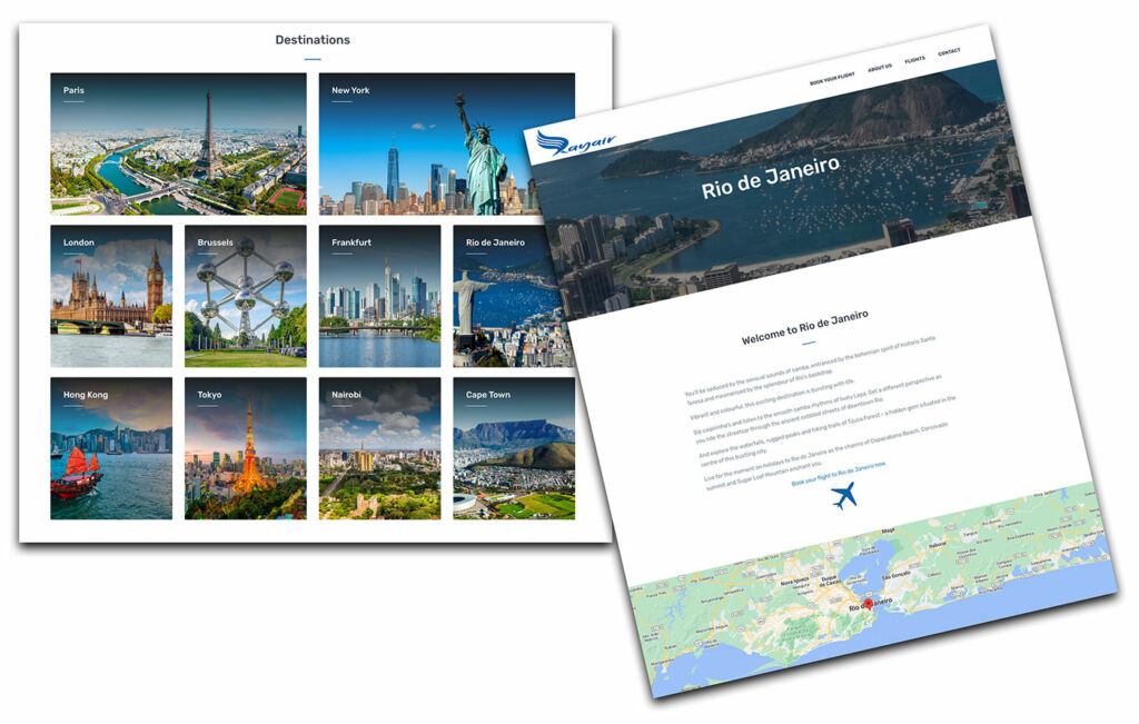
*** Poor scan ability: the problem mentioned here is that the user must hover on many links to find his way to the existing destinations, after 2 or 3 clicks. To avoid this problem, I displayed the links of all existing destinations on the landing page ( homepage ), illustrated with appealing photos of each city. Each link brings to a full page with description of the assets of the city and a direct link for booking a flight.
*** Visual overload: cluttered website overwhelms users with too much information, making it hard for them to locate the information they’re looking for. After selecting the departure and arrival places and date in the form, the flight list page popped up with an overloaded section of class options with pictures and hyperlinks triggering pop-up tags with explanation when hovered on. To solve this problem, I used chunking to smooth the flow of the booking form. I split the form process into smaller chunks: After selecting the departure and arrival places and date in the form, a pop-up tag with a brief description of class options ask the user to select the number of passengers in the flight class of his choice.
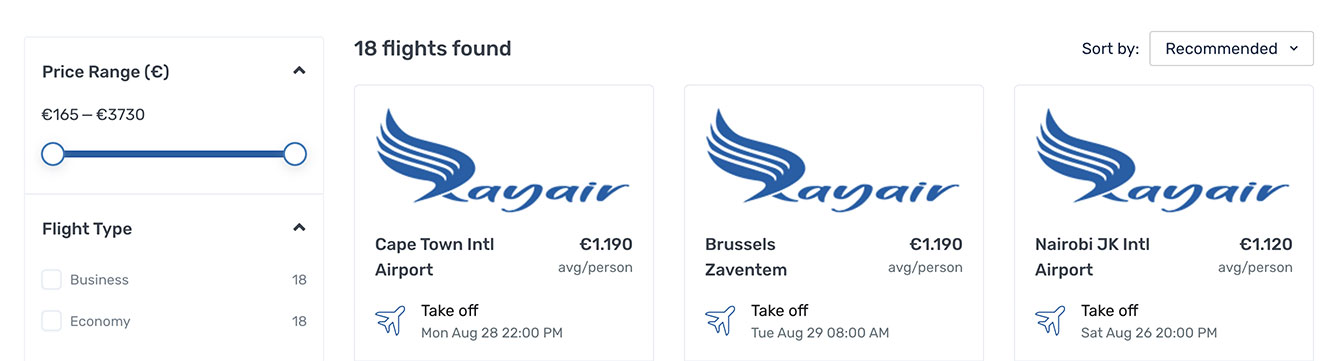
 *** Uncertainty and Frustration: users often visit a website with a specific budget in mind. If they have to go through the whole list of flights to find the flight that fits in their budget, it may result in wasted time and lead to frustration. To avoid this problem, I added a price range filter on the flight list page, which will allow users to look for the flights within their budgets in one click.
Copyright © Raysys